Develocity Trends & Insights allows dev teams to respond proactively to systemic problems and longer-term performance regressions. It does this by providing a Trends Dashboard that makes key metrics and KPIs more observable and actionable. In this post, I share two simple but powerful tips for using trend data to interpret and evaluate build performance. I then demonstrate these principles by analyzing trends from an actual Develocity customer.
Choose your goal
It is best to focus on a specific aspect of performance, such as reducing the percentage of extremely slow builds, increasing the percentage of extremely fast local builds.
Before looking at trends data, you should isolate a reasonably homogenous set of builds by using the search filters atop all Develocity dashboards. I recommend measuring one project at a time.
I tend to focus on the 25th-75th percentile build time data (see darker blue band in images below) to see what most developers are experiencing under “normal” circumstances.
Pro-tip: you can also show and hide trend lines by clicking on them in the legend to focus on the performance trend you’re most interested in.
Remove the noise
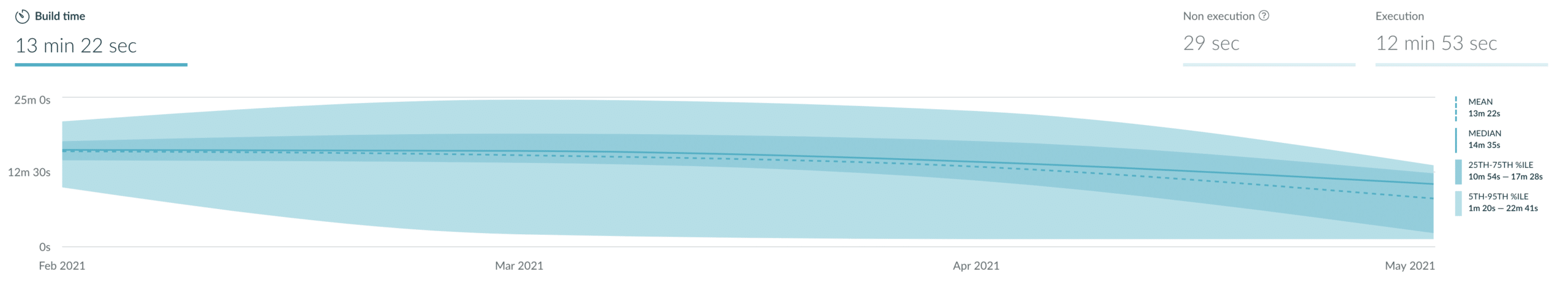
Once you’ve specified filters to report on your target project or environment, you should pick the right time granularity. Weekly and monthly granularity are superior to noisy daily data when monitoring build performance over time. Just look at these two charts:
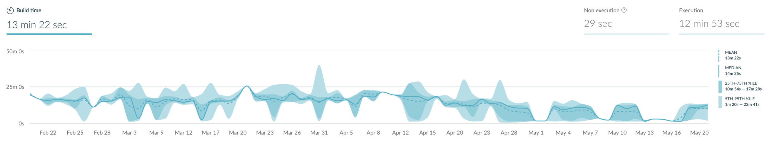
Daily data is useful for narrowing down the exact time an improvement or regression occurred. The Performance Dashboard will help you identify specific builds to analyze once you’ve narrowed your time range.
Pro-tip: the metrics on the right side change as you hover over data points in the chart so that you can see the exact percentiles over time.
Example analysis
Here is a build time trend chart and the analysis I provided to a customer recently. The goal is to improve the “average” build experience, but I also evaluated other aspects of the build experience.
I analyzed weekly data to avoid noise but preserve more detail about when trends change.
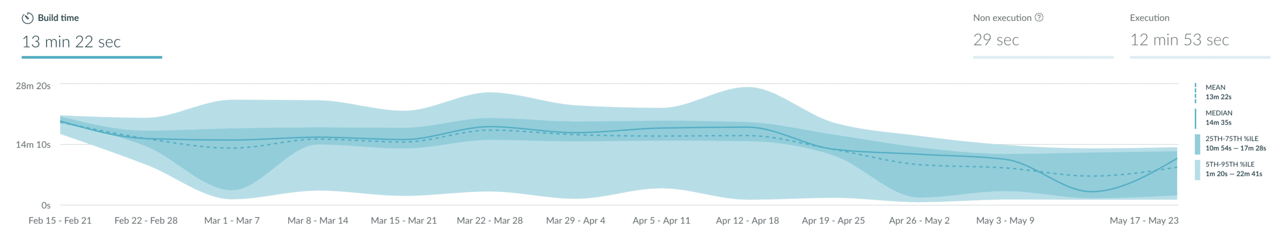
- You can see that on April 1st, only half of the builds were 17 minutes or faster. On May 1st, over 95% of builds were 17 minutes or faster. Thus the customer has measurably reduced the percentage of “slow” builds.
- The majority of builds (25th-75th band) were around the same duration from February through April, but then the 25th percentile drops way down to ~3 minutes. That means that a significantly larger proportion of builds (maybe 20% more) are faster than it would take to get a cup of coffee. Thus the customer measurably increased the percentage of relatively fast builds.
- Finally, median build time decreased from 12.5 minutes to 10 minutes since April, a 20% improvement. This proves that the customer achieved their goal of improving the average build experience.
Conclusion
Since “faster builds” can mean different things, it’s best to have a goal in mind and focus on a specific aspect of build performance. Isolate the builds you’re interested in, and which metrics and trends will help you best measure your goal. Be sure to take advantage of the views, filters, and data granularity options in Develocity that will help you visualize your goal and measure results.
I hope this was informative. We have some big updates cooking. Please drop us a line if you have questions or if you want to become a part of improving developer productivity worldwide.